IU Online App
UX Design
In Fall 2020, I enrolled in a product management course, which allowed my team to work with industry professionals to improve their products using our skills. Product managers from Deloitte, Microsoft, and Google provided feedback to our class and judged our ideas at the end of each project*.
* The product managers we worked with do not represent their respective companies. Any features we ideated are created using public information.
All four teams that I was in received first place out of 12 teams in the class.
Deloitte
Our team was asked to create a solution for an imaginary bank to more attract Affluent Young Families (AYF's) to use their services. We came up with the idea of Virtual Visits, a way for customers to connect with each other and meet with bank representatives face-to-face on their devices.
Microsoft
In this project, we were asked to choose a Microsoft 365 product and improve its accessibility features. Through our research, we identified pain points for users with dyscalculia and provided a solution for them to interact with Excel in an easier way.
We were asked to develop ideas for how Google can increase trust among its users through making changes in Google Ads and other Google products. In this project, we matched user pain points with product visions, and created five features that will solve our users' pain points.
Robinhood
For our last project, we had the freedom to pick a company of our choice. Our team decided to create a more-informed trading experience for users. We researched Robinhood's mission and its competitors initiatives to make trading better for inexperienced users. Our result was five features that allow users be more educated in stock trading.
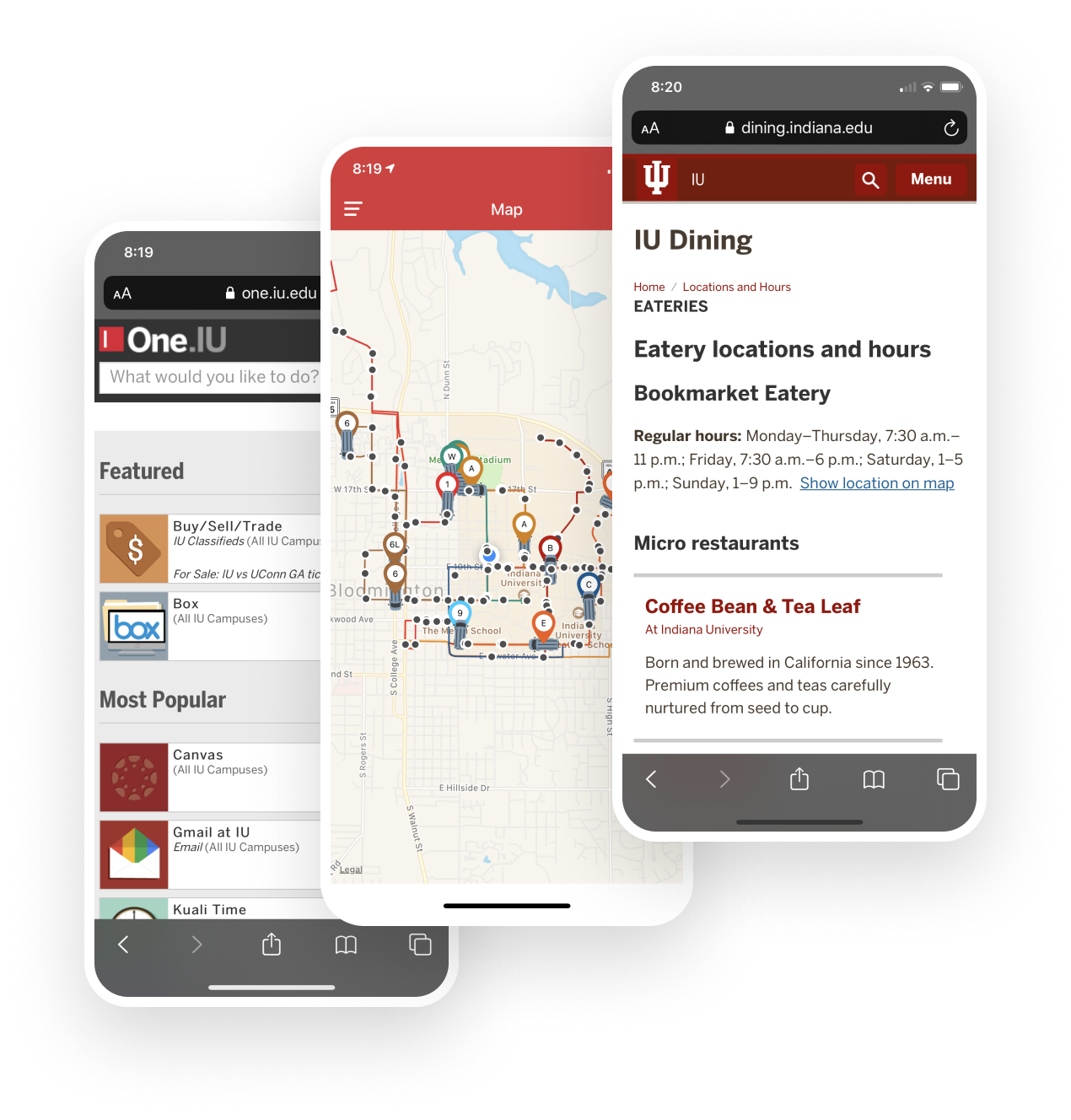
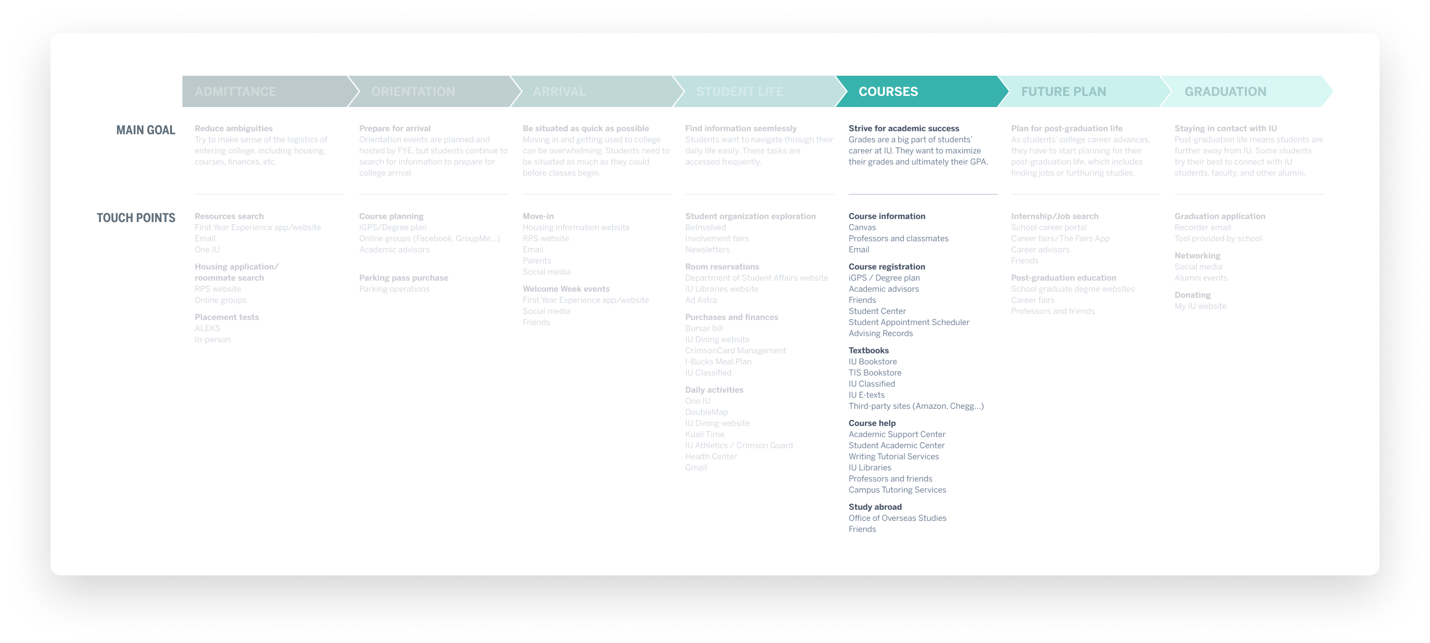
The mobile experience and design for students at IU were very outdated. It washard for students to find useful information as information are fragmented into different websites and applications. Moreover, there were repetitive tasks that student do that are not easily accessible through a mobile phone. This is what the disjointed experience looked like:
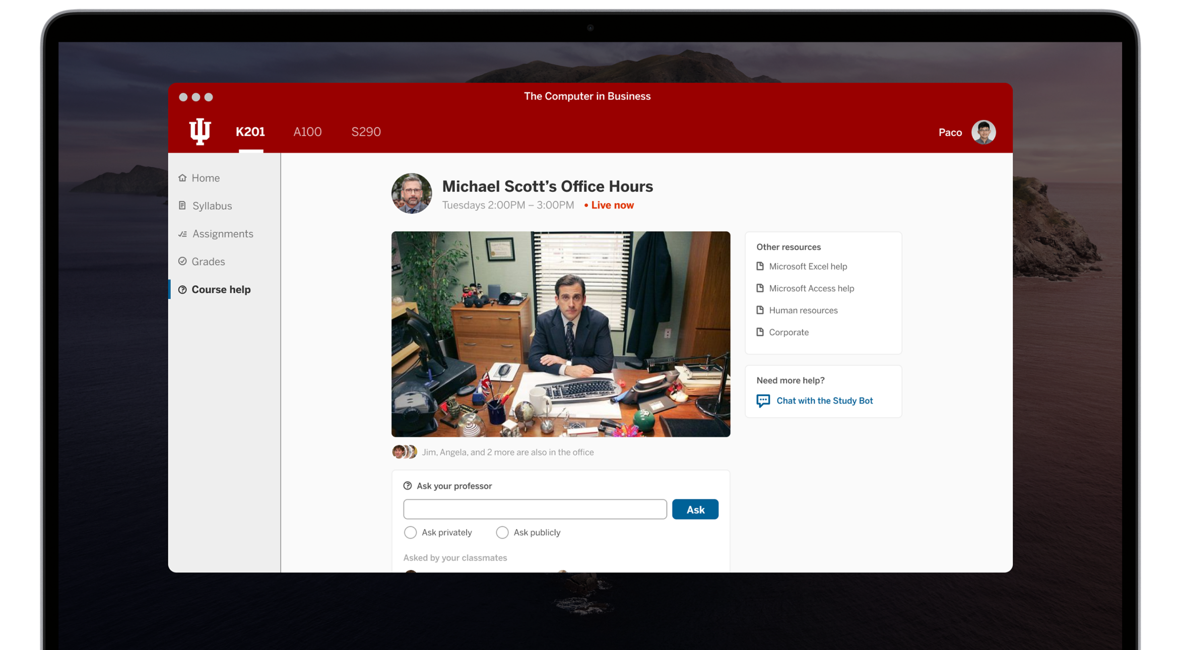
I seeked out an opportunity to demo my prototype to IU’s UX Office, which led to a job offer as a UX Engineer.
These problems frustrated me, so I decided to create a iOS application for myself to make finding information easier. A native iOS application allows for a smoother and more seamless interaction. Eventually, I wanted the application to be the go-to application for anything student-related.
Design Process


To accommodate the different types of users (guests, students, and staff), I drew mockups of the app layout to ensure the information is presented in a thoughtful and logical way. These mockups are presented to my managers and students for further feedback and improvement.
Since there are hundreds of features we wanted to incorporate into the app, it became crucial to start prioritizing the most important ones to focus on. We listed the current features and improvement opportunities and narrowed down our development priorities based on student feedback, development capacity, and time.
Takeaways
Not only did I learn more about UX design, I’ve also learned various design techniques I can apply to other projects, how to effectively collaborate with colleagues in a workplace, the process of working in a large organization, and more.
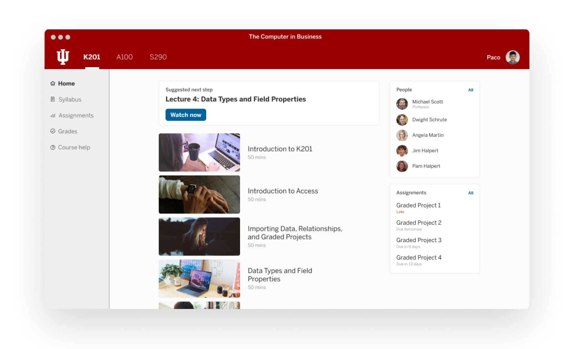
As part of IU’s efforts to improve its digital campus, I was tasked to ideate and design a vision for what a desktop app for the IU Online program looks like. Currently, the IU Online campus lacks student interactions, and resources are fragmented across different websites. My design aims to create an online experience as good as a physical one.
Using Figma, I created wireframes and high-fidelity prototypes to showcase what a desktop application for IU Online would look like, including the registration process to a professor's office hours online. These designs came just in time as coronavirus generated a need to create a desktop application for all IU students. The official IU Online desktop application launched in August 2020.
Design Process
Throughout the design process, I communicated with my superiors to receive feedback of my design process and end product. I iterated my wireframes and prototypes based on their feedback before I reached the end design you see here.
Takeaways
As I rarely get to work on a product from the ideation process to the final design, I was very excited when I received the opportunity to work on this project. I learned a lot about the importance of creating alternatives from which I can achieve the desired solution, and prioritizing which method is best to do so.
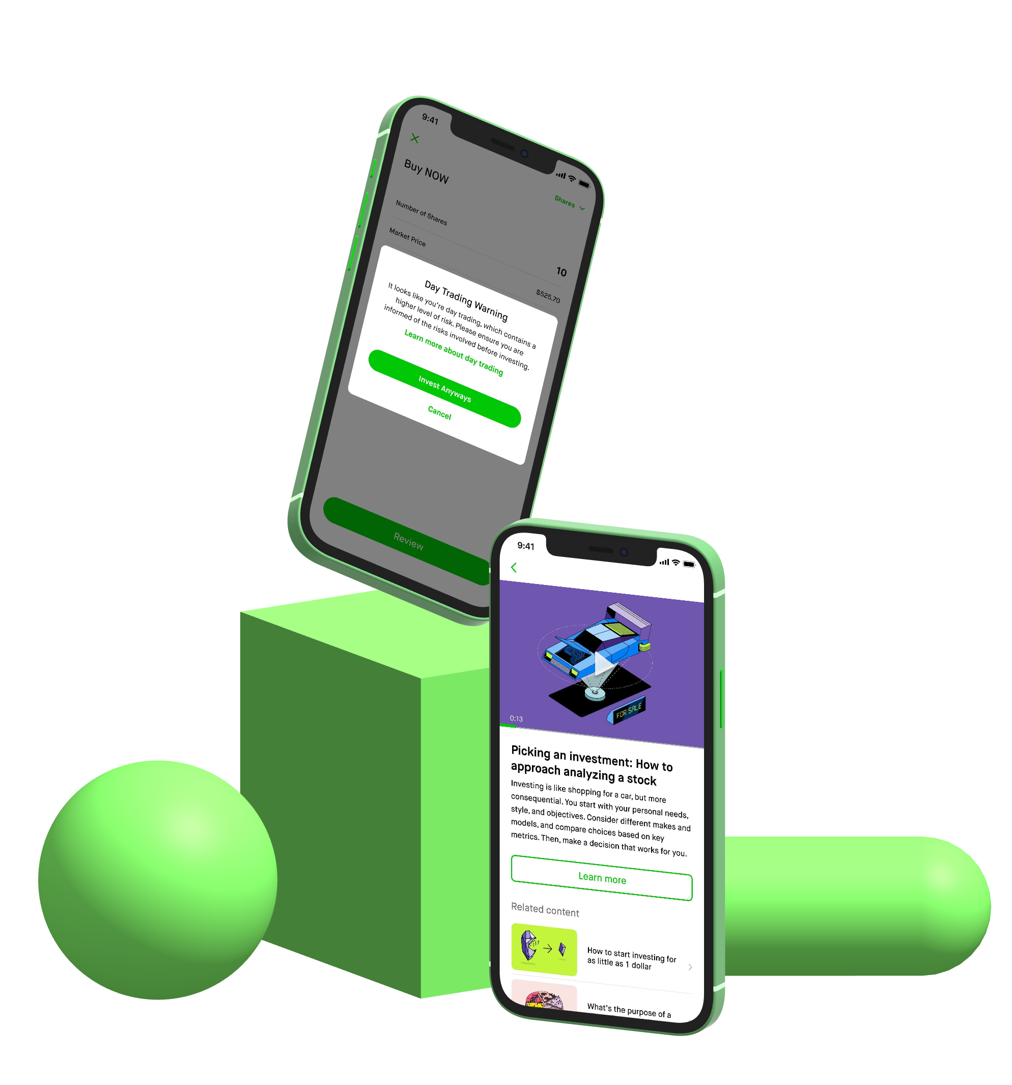
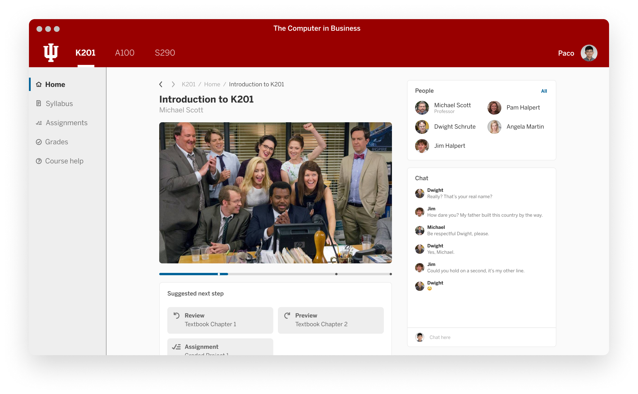
In the midst of the coronavirus pandemic, I particpated in my first Adobe Creative Jam with Airbnb to challenge and improve myself with the extra time at home. In this challenge, I worked with two other teammates to create an Adobe XD prototype within 40 hours.
The challenge was to empower families and groups of friends who travel together a collaborative way to document, organize, and share their travel experiences and stays to the larger Airbnb community.
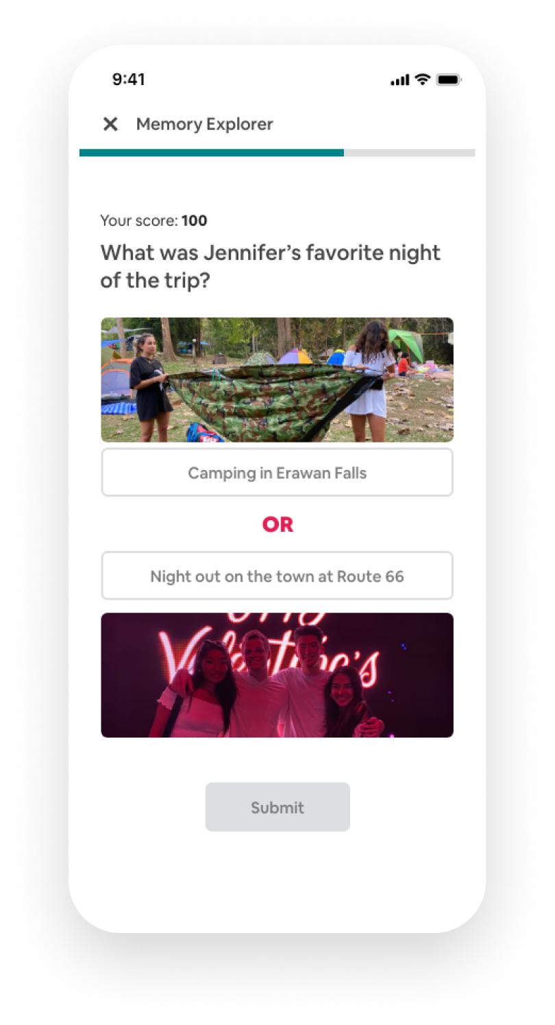
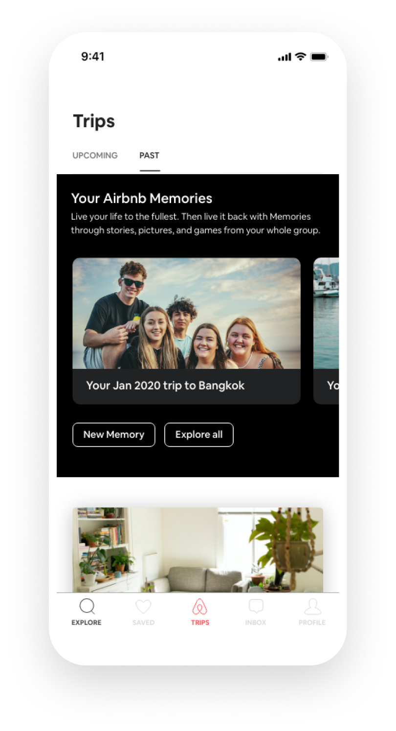
After 40 hours of hard work, we created Airbnb memories, where users can not only relive their trips’ best moments, but gain new enjoyment from a fun way to engage with it. The Memory Explorer game also lets users test their knowledge of tripmates in a fun and engaging way.
User Research
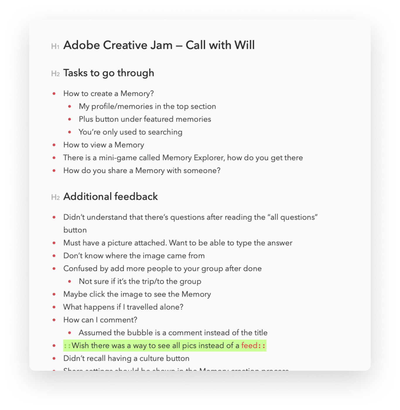
After creating our initial prototypes, we conducted an Airbnb user for a usability testing session over Zoom. In the session, we identified pain points in the prototype that we overlooked initially, allowing us to further improve the design and navigation of the prototype.
Takeaways
Although I have participated in different business case competitions before, this was my first design challenge. This is also the first time that I designed for a "client". Therefore, I have learned a lot about designing in short timeframes and understanding a client's need when designing a solution for them. Overall, I learned:
- How to work effectively with different stakeholders, including engineers and copywriters to create the best product for users.
- The importance of user testing even when time is limited, as it exposes different shortcomings of a product.
- Understanding the requirements and clarifying any ambiguous points before starting a design.
Let's get in touch!
I love meeting and chatting with new people. Feel free to send me an email if you want to get in touch or learn more about what I do!